As websites become more sophisticated and user-friendly, animations have emerged as a valuable tool for enhancing the user experience. From subtle hover effects to complex animations that illustrate a product’s features, animations can make a site more engaging, memorable, and enjoyable to use.
However, to create animations that are both effective and efficient, using code is necessary. Although there are many third-party animation tools available, relying solely on them can lead to bloated code, sluggish performance, and a lack of customization. In contrast, coding animations using CSS, SVG, and JavaScript can deliver fast-loading, lightweight animations that are tailored to your site’s needs.
In this blog post, we will explore the different types of animations that can be created using code, including CSS animations, keyframe animations, transform animations, SVG animations, and JavaScript animations. We’ll explain how each works and provide examples of how to create them. By the end of this post, you’ll have a solid understanding of how to use code to create stunning animations that will elevate your website’s user experience.
So let’s dive into the world of animations and see how code can help us create them!
Understanding CSS Animations
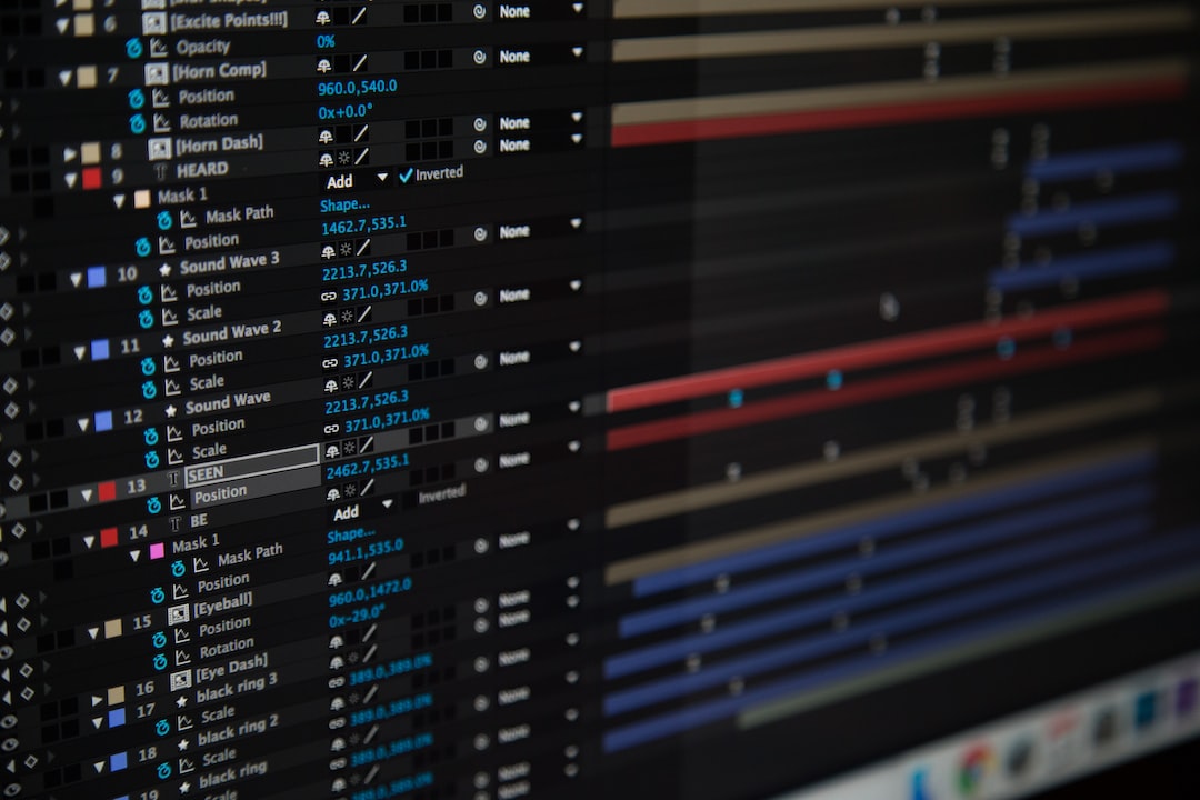
When it comes to creating animations on websites, CSS is a popular choice among web designers and developers. CSS (Cascading Style Sheets) is a language used to style web pages and give them a visually appealing design. With the addition of CSS animations, we can now create dynamic and engaging animations that bring web pages to life.
CSS animations are a way to apply visual effects to an HTML element by manipulating its properties over time. They allow us to create animations without the need for external libraries or plugins. Instead, we can use simple CSS code to define the animation properties.
To create a CSS animation, we first need to define the animation using the @keyframes rule. This rule defines the animation’s beginning and end states, as well as any intermediate steps in between. We can then apply the animation to an HTML element using the animation property.
The animation property has several values that we can use to control how the animation behaves. We can set the duration of the animation, the number of times the animation should repeat, and whether the animation should play in reverse. We can also use timing functions to control the rate at which the animation progresses.
CSS animations are not just limited to simple transitions between states. We can also use them to create more complex animations, such as animations that change an element’s shape or size. Transformations, such as scaling and rotating, can also be applied to elements to create unique and dynamic effects.
Overall, CSS animations are a powerful tool for creating engaging and interactive websites. With their ease of use and flexibility, they are a great addition to any web designer’s toolkit. By using code to create animations, we can achieve stunning visual effects that enhance the user experience and make our websites stand out.
They allow us to create animations without the need for external libraries or plugins.
Keyframe Animations

Keyframe animations are a powerful way to create complex and intricate animations on your website. Essentially, a keyframe animation is an animation that is created by defining specific points along the animation timeline where different styles should be applied to an element.
To create a keyframe animation, you will need to use the @keyframes rule in your CSS code. This rule allows you to define different styles that should be applied to an element at specific points during the animation timeline.
For example, let’s say you want to create an animation that causes an element to move across the screen while changing color. You could use the following code:
@keyframes my-animation {
  0% {
    color: red;
    transform: translateX(0);
  }
  50% {
    color: blue;
    transform: translateX(100px);
  }
  100% {
    color: green;
    transform: translateX(200px);
  }
}

.my-element {
  animation: my-animation 2s ease-in-out infinite;
}
In this example, we have defined a keyframe animation called my-animation. This animation has three keyframes: one at 0%, one at 50%, and one at 100%. At each of these keyframes, we have defined different styles that should be applied to the .my-element class.
To make the animation run, we have applied the animation property to the .my-element class. This property tells the browser to use the my-animation animation, run it for 2 seconds, with an ease-in-out timing function, and repeat it indefinitely.
Keyframe animations can be used to create a wide range of animations, from simple color changes to complex multi-step animations. The possibilities are virtually endless, and by using keyframe animations, you can create animations that are unique and tailored to your specific needs.
So why not give it a try? With a little bit of practice, you’ll be creating stunning animations that will make your website stand out from the crowd.
my-element class.
Transform Animations
Transform animations are another type of CSS animation that can enhance your website’s design and functionality. They allow you to manipulate the position, size, and shape of an element on your web page.
Transform animations can be done using the transform property in CSS. This property allows you to apply various transformations to your selected element, such as rotating, scaling, skewing, or translating.
To create a transform animation using CSS, you need to define the starting and ending states of the element you want to transform. You can do this by using the transform property with a specified value for each transformation. You can also use transition properties to specify the duration and timing function of the animation.
For example, to create a rotating animation for an image, you can use the following CSS code:
“`
img {
transform: rotate(0deg);
transition: transform 1s ease-in-out;
}
img:hover {
transform: rotate(360deg);
}
“`
This code will animate the image to rotate 360 degrees when the mouse hovers over it. The animation duration is set to 1 second, and the timing function is set to ease-in-out, which means the animation starts slowly, accelerates, then slows down at the end.
Transform animations can also be combined with other CSS properties, such as opacity, to create more complex and dynamic effects. For example, you can create a zoom-in animation for a button when it’s hovered over, like this:
“`
button {
transform: scale(1);
opacity: 1;
transition: transform 0.3s ease-in-out, opacity 0.3s ease-in-out;
}
button:hover {
transform: scale(1.1);
opacity: 0.8;
}
“`
This code will animate the button to scale up and slightly fade out when the mouse hovers over it. The animation duration is set to 0.3 seconds for both transformations, and the timing function is set to ease-in-out.
In summary, transform animations are a powerful tool that can bring life and interactivity to your website. They allow you to create various visual effects and transitions that can enhance the user experience and make your website stand out. By using CSS and a bit of creativity, you can create stunning animations that will leave a lasting impression on your visitors.
In summary, transform animations are a powerful tool that can bring life and interactivity to your website.
Animate Your SVGs with Code

Scalable Vector Graphics (SVGs) are becoming increasingly popular in website design due to their flexibility and scalability. Animating SVGs can add an extra layer of interactivity to your website and grab the attention of your audience. With code, animating SVGs is not only easy but you can also achieve stunning results that cannot be achieved with traditional graphic design software. Here are some tips on how to animate SVGs using code:
- Choose Your SVG: The first step in animating an SVG is choosing the right graphic. Depending on the complexity of the animation, you may want to select a simple SVG with only a few paths or a complex SVG with multiple layers. Keep in mind that the more complex the SVG, the more time and effort it will take to animate.
- Identify Your Element: Once you have selected your SVG, you need to identify which element you want to animate. This could be a path, a group of paths, or the entire SVG itself. By selecting the element, you can manipulate its properties with code to create the animation.
- Define Your Animation: The next step is to define your animation using CSS or JavaScript. CSS animations are a great option for simple animations, while JavaScript can be used for more complex animations. You can define the duration, timing function, and other properties of the animation in your code.
- Use Keyframes: To create more complex animations, you can use keyframes to define the various stages of the animation. Keyframes allow you to create more fluid and realistic animations. By combining multiple keyframes, you can create a seamless animation that brings your SVG to life.
- Test and Refine: Once you have defined your animation, it’s important to test it across various browsers and devices to ensure compatibility. You may need to make adjustments to your code to ensure that the animation runs smoothly on all platforms. Don’t be afraid to experiment and refine your animation until you achieve the desired effect.
Animating SVGs with code can be a fun and rewarding experience. By following these tips, you can create stunning animations that add an extra layer of interactivity to your website. Don’t be afraid to experiment and try new things. With code, the possibilities are endless!
With code, the possibilities are endless!
JavaScript Animations
JavaScript is another powerful tool that can be used to create animations on your website. With JavaScript, you can create complex and dynamic animations that are not possible with CSS alone.
One advantage of using JavaScript for animations is that it allows you to control the animation with more precision. You can create animations that respond to user interaction, such as mouse clicks and keyboard events. This can make your website more engaging and interactive, and can help to keep your visitors on your site for longer.
When using JavaScript for animations, there are a few different approaches you can take. One popular method is to use a library such as jQuery or GreenSock. These libraries provide pre-built functions and methods that make it easier to create animations with JavaScript. They also handle cross-browser compatibility issues, making it easier to create animations that work across different browsers.
Another approach is to use the native JavaScript animation methods, such as requestAnimationFrame and setTimeout. These methods allow you to create animations from scratch, and offer more control over the animation process. However, they require more coding knowledge and can be more difficult to implement.
Regardless of the approach you take, there are a few key concepts to keep in mind when creating JavaScript animations. First, it’s important to optimize your code for performance. Animations can be resource-intensive, so you need to make sure that your code is efficient and doesn’t slow down your website.
Second, you should design your animations with the user in mind. Animations should enhance the user experience, not detract from it. They should be subtle, smooth, and purposeful, and should not distract from the content on your website.
JavaScript is a powerful tool for creating animations on your website. It allows you to create dynamic and engaging animations that can help to keep your visitors on your site for longer. Whether you choose to use a library or write your animations from scratch, be sure to optimize your code for performance and design your animations with the user in mind. With these tips in mind, you can create stunning animations that will take your website to the next level.
You can create animations that respond to user interaction, such as mouse clicks and keyboard events.
Conclusion: Create Stunning Animations with Code
Animations are essential in making websites more engaging and interactive for users. They can provide a more immersive experience, communicate information more effectively, and make websites stand out from the competition. However, to achieve stunning animations, it is necessary to use code.
In this blog post, we’ve explored various aspects of animation using code, including CSS animations, keyframe animations, transform animations, animating SVGs, and JavaScript animations. By creating animations using code, you have more control over the animation’s behavior and can fine-tune it to match your website’s design and branding.
If you’re new to using code in animations, don’t worry. There are plenty of resources available online to help you get started. Websites like Codecademy offer free courses on learning CSS, JavaScript, and other programming languages. Additionally, there are communities of developers and designers who share their knowledge and provide feedback.
Overall, using code to create stunning animations is a valuable skill for any website developer or designer. With the knowledge and tools available, there’s no reason not to add animations to your website and make it stand out from the crowd. So what are you waiting for? Start coding and create some amazing animations for your website today!