
In today’s digital age, mobile devices have become a necessity for people all around the world. With the growing number of mobile devices being used, it is important for developers and designers to understand responsive design for mobile apps. Responsive design is a web design approach that aims to provide an optimal viewing and interaction experience across a wide range of devices, from desktop computers to tablets and smartphones. The goal of responsive design is to ensure that the application adapts to different screen sizes, device capabilities, and orientations while maintaining a consistent user experience. A mobile app with responsive design not only improves usability and enhances user experience but also increases the overall performance of the application. In this blog post, we will explore the fundamentals of responsive design for mobile apps, and how you can optimize mobile app performance through this design approach. So, sit tight and let’s dive in!
Building Blocks of Responsive Design
Responsive design is a must-have for all mobile apps. Building a responsive design is not rocket science, but it is important to understand the building blocks of creating a mobile app for different platforms, devices and screen sizes. The building blocks of responsive design include CSS, HTML and JavaScript.
CSS is the primary building block for responsive design. This is because CSS defines how the content of a mobile app should be presented to various devices’ screen sizes. When creating a mobile app, it is important to consider various mobile devices, tablets and desktop devices. This is where using media queries come into play. Media queries are a CSS technique that allows you to apply different styles to different devices.
HTML is also a primary building block for responsive design. This is because HTML provides the structure of the mobile app itself. When creating a mobile app, it’s important to consider the content of the app itself. The HTML structure of the app should be designed in such a way that it is flexible enough to accommodate different devices and screen sizes.
JavaScript provides the interactivity of a mobile app. When designing a mobile app, it’s important to strike a balance between interactivity and responsiveness. JavaScript comes in handy when creating interactivity within the app. It is essential to use relevant JavaScript frameworks to optimize mobile app performance.
A responsive design should be considered the bare minimum for any mobile app. As such, designers and developers should strive to create an optimized mobile app experience that is device and screen size agnostic. A responsive design should be considered a work-in-progress, requiring constant review and updates to keep up with advancements in mobile app technology.
In summary, CSS, HTML, and JavaScript are the building blocks of responsive design. Together, they provide the framework towards creating an effective UX/UI for mobile devices. Building a responsive design requires a balance between interactivity and responsiveness, and should be optimized for different mobile devices and screen sizes. In the next section, we will be discussing how to consider your target audience when building a mobile app.
Building Blocks of Responsive Design
Responsive design is a must-have for all mobile apps.
Considering the Target Audience
When designing a mobile app, it is important to keep the target audience in mind. This means understanding their unique needs, preferences, and behaviors. For example, a gaming app aimed at teenagers will have a very different design than a banking app aimed at adults.

One aspect to consider is the user’s demographics. Age, gender, income level, education level, and location all play a role in determining the design of the app. For instance, a younger audience may prefer a more colorful and playful interface, while an older audience may prefer a more professional and streamlined interface.
Another aspect of the target audience is their technology usage habits. Understanding what devices your audience uses most frequently will help determine which operating systems and screen sizes you should prioritize when designing the app. It’s also important to consider how familiar the target audience is with technology. A more tech-savvy audience may prefer a complex UI, while a less tech-savvy audience may be intimidated by too many options and features.
Lastly, consider the user’s goals and motivations for using the app. Are they using the app for entertainment, information, or completing a task? Knowing this information will help guide the design of the app and ensure that it meets the needs of the target audience.
In conclusion, understanding the target audience is crucial when designing a mobile app with responsive design. Demographics, technology usage habits, and motivations for using the app all play a role in determining the design of the app, ultimately leading to a better user experience.
Considering the Target Audience
When designing a mobile app, it is important to keep the target audience in mind.
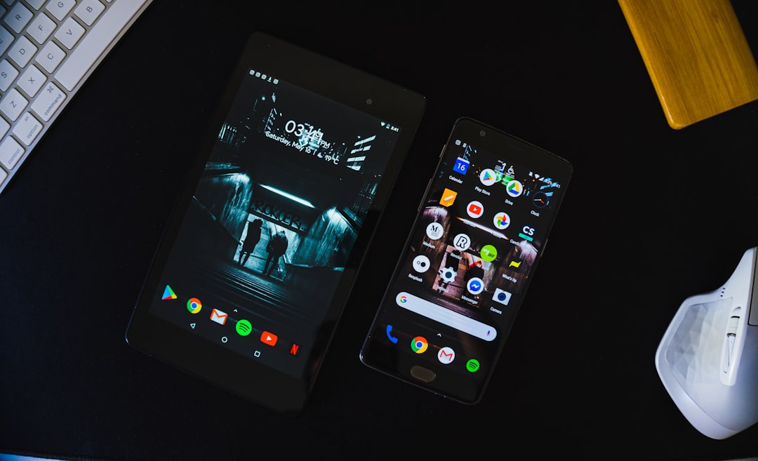
Designing for Different Devices
Mobile devices come in all shapes and sizes, from smartphones to tablets and everything in between. When it comes to designing for different devices, it’s important to keep in mind that users will be accessing your app on a variety of devices with varying screen sizes and resolutions.
One approach to designing for different devices is to use a responsive layout. With responsive design, the layout of the app adapts to the screen size of the device it’s being viewed on. This means that a user accessing the app on a small smartphone will see a layout that’s optimized for a smaller screen, while a user accessing the app on a larger tablet will see a layout that’s optimized for a larger screen.
Another approach to designing for different devices is to create separate layouts for different screen sizes. This can be a more time-consuming approach, but it allows for greater control over the layout and can result in a more optimized experience for users on each device.
In addition to considering screen size, it’s also important to consider the capabilities of the device when designing for different devices. For example, some devices may have limited processing power or memory, while others may have advanced hardware that allows for more advanced features.
When designing for different devices, it’s important to consider the user experience and ensure that the app is optimized for each device. This can involve making decisions about what features to include or exclude for each device, as well as making decisions about the layout and navigation of the app.
Ultimately, designing for different devices is an important part of creating a responsive mobile app. By considering the capabilities of each device and designing for the specific needs and preferences of your target audience, you can create an optimized experience that will keep users engaged and satisfied with your app.
One approach to designing for different devices is to use a responsive layout.
Developing an Effective UX/UI for Mobile Devices
When it comes to mobile app performance, ensuring an effective UX/UI is of utmost importance. In today’s world where users have multiple options for the same app, a negative user experience can lead to uninstallation and loss of customers. Therefore, it is crucial to offer users an engaging, intuitive, and visually appealing interface.
To develop an effective UX/UI, you need to understand your target audience and get feedback from them. You should adopt a user-centric approach that involves designing for users’ specific needs and behaviors. This includes selecting the right font size, color, and images that fit your brand, making it easy for users to navigate the app, and ensuring that the design is consistent throughout the app.
One of the top considerations when designing an effective UX/UI is to prioritize the content hierarchy. Every element in the app should be designed with the user in mind. The primary goal is to ensure that users can quickly and easily accomplish their goals within the app. For instance, placing the call-to-action button in the right place and at the right time can significantly improve the user experience.
Another vital aspect to consider when designing an effective UX/UI is to ensure that the app’s interface adapts to different screen sizes and devices. It is essential to conduct thorough market research and user testing on a variety of mobile devices to test the functionality of the app.
In addition to design considerations, UX/UI development must also include performance optimization. This includes minimizing loading time, optimizing image size, and ensuring fast app responsiveness. Users expect an app that is responsive, interactive, and provides real-time feedback, and failure to deliver on this can lead to uninstallation and loss of customers.
In conclusion, an effective UX/UI design is essential for mobile app performance. It helps to provide users with a seamless experience and ensures that their needs are met. With the right approach, a top-rated UX/UI can lead to better user acquisition, user retention, and improved customer satisfaction. So, to build an effective mobile app, prioritize an engaging, intuitive, and visually appealing UX/UI design.
The primary goal is to ensure that users can quickly and easily accomplish their goals within the app.
Testing and Measuring Performance

As you develop your responsive design, it’s important to test and measure the performance of your mobile app. This step is crucial to ensure that your app is functioning properly on a variety of devices and platforms.
One approach is to use automated testing tools to conduct performance tests. Many testing tools are available that simulate user activity on different devices and platforms. These tools can help you identify potential problem areas in your design, such as slow loading times, broken links or images, and other issues that can negatively impact your users’ experiences.
Another important aspect of measuring performance is to collect data and analytics from your users. This data can help you understand how your app is performing across different devices and platforms, as well as identify trends and patterns in user behavior. You can use this information to optimize and refine your design over time, ensuring that it is always meeting the needs of your target audience.
It’s also essential to consider the impact of network conditions on your app’s performance. Mobile users often have varying levels of connectivity depending on their location and network provider. You should test your app’s performance under different network conditions, such as low bandwidth or poor connectivity, to ensure that it remains accessible and usable in all situations.
In addition to testing your app’s technical performance, it’s also important to measure its usability and user satisfaction. Gathering feedback from your users via surveys, focus groups, or user testing sessions can provide valuable insights into how well your app is meeting their needs and expectations.
By focusing on testing and measuring the performance of your responsive design, you can ensure that your mobile app provides a high-quality experience for your users on any device or platform.
These tools can help you identify potential problem areas in your design, such as slow loading times, broken links or images, and other issues that can negatively impact your users’ experiences.
Conclusion: Optimizing Mobile App Performance with Responsive Design
Responsive design plays a significant role in mobile application development, offering users an exceptional experience across different devices. Moreover, it helps businesses in engaging and retaining their users by optimizing performance through adaptive layouts, device-specific features, and targeted user experiences.
In conclusion, we have delved into the fundamentals of responsive design and how it can facilitate the creation of mobile applications that cater to the needs of diverse audiences. By following the guidelines we have laid out and incorporating responsive design principles, you can rest assured that your mobile application will perform optimally, regardless of the device being used.
In summary, responsive design empowers developers and designers to create immersive and responsive mobile applications that can engage a range of users, and will provide the ultimate user experience. Remember, it is essential to design an application not only for aesthetics but also to address the unique preferences, needs, and expectations of its users. Therefore, we recommend you incorporate responsive design principles into your mobile application development process and see how it helps you unleash the full potential of your app!