CSS gradients are an essential part of modern web design, allowing designers to create beautiful and dynamic backgrounds and effects on their websites. A gradient is a smooth transition between two or more colors, typically displayed in a linear or radial pattern.
In the early days of web design, gradients were achieved using images or solid colors, which limited the creative options available to designers. However, with the emergence of CSS gradients, designers can create more complex and unique designs without the need for additional images or JavaScript.
CSS gradients have become a crucial part of the web design toolkit because they provide a range of benefits. For instance, they can be used to create depth, texture, and dimension to flat designs. They can also help to draw attention to particular elements or add visual interest to otherwise plain backgrounds.
Moreover, CSS gradients are highly adaptable and can be customized to suit the needs of specific projects. They can be modified by changing the colors, angle, and direction of the gradient, allowing designers to create unique and personalized designs.
In summary, CSS gradients are an important feature of modern web design. They provide a versatile and flexible way of creating dynamic backgrounds and effects that can add depth and visual interest to web pages. In the following sections, we’ll explore the different types of CSS gradients available, how to create them, and tips for using them effectively in your design projects.
Types of CSS Gradients
CSS gradients are a great way to add visual interest to your website or application. With CSS gradients, you can create beautiful, colorful backgrounds and patterns that are sure to catch the eye of your visitors. There are several different types of gradients available in CSS, including linear, radial, and multiple gradients.

Linear gradients are the most basic type of gradient and are created by specifying two or more colors and the direction in which the gradient should be applied. Radial gradients are similar to linear gradients, but they are circular in shape and radiate out from a central point. Multiple gradients, as the name suggests, allow you to create a gradient with more than two colors.
Each type of gradient has its own unique properties and can be useful in different situations. For example, linear gradients can be used to create a sense of movement or direction on a page, while radial gradients can be used to draw attention to a specific element. Multiple gradients can be used to create complex patterns or textures that would be difficult or impossible to achieve with a single gradient.
Regardless of the type of CSS gradient you choose to use, it’s important to understand how to create them and how to use them effectively. In the next section, we’ll go over the steps you need to follow to create simple gradients using CSS.
For example, linear gradients can be used to create a sense of movement or direction on a page, while radial gradients can be used to draw attention to a specific element.
Creating Simple Gradients

When it comes to creating simple gradients in CSS, there are a few things you need to keep in mind. Gradients are created using the “background-image” property in CSS, and you can use a linear or radial gradient to achieve the desired effect.
To create a linear gradient, you’ll need to specify the starting and ending points of the gradient along with the colors you want to use. For example, let’s say you want to create a simple gradient that goes from top to bottom and uses two colors – blue and white. Here’s what the CSS code would look like:
“`
background-image: linear-gradient(to bottom, blue, white);
“`
This code tells the browser to create a linear gradient that starts at the top and ends at the bottom of the element, with the first color being blue and the second color being white.
If you want to create a radial gradient, you can use the “radial-gradient” function. Here’s an example:
“`
background-image: radial-gradient(circle, blue, white);
“`
This code creates a radial gradient that starts at the center of the element and radiates outwards in a circular pattern, with the first color being blue and the second color being white.
Of course, you can experiment with different colors, gradients, and shapes to create unique and interesting effects. The possibilities are truly endless!
One thing to keep in mind is that older browsers might not support CSS gradients, so it’s always a good idea to provide a fallback background color just in case. You can do this by adding a comma after the gradient code and specifying a solid background color:
“`
background-image: linear-gradient(to bottom, blue, white), #fff;
“`
This code creates a linear gradient from blue to white, and if the browser doesn’t support gradients, it will display a solid white background instead.
In summary, creating simple gradients in CSS is a great way to add visual interest and depth to your web designs. With a little bit of experimentation and creativity, you can create unique and eye-catching effects that will make your website stand out from the crowd.
With a little bit of experimentation and creativity, you can create unique and eye-catching effects that will make your website stand out from the crowd.
Adding Color Stops to Gradients

When it comes to creating gradients that are truly unique and eye-catching, adding color stops can make all the difference. Color stops allow you to specify where one color begins and another ends within your gradient, creating a more complex and interesting effect than a basic two-color gradient.
To add color stops to your gradient, you’ll first need to define the colors you want to use. This is done using the color-stop() function, which takes two arguments: the first is the position of the color stop, expressed as a percentage, and the second is the color of the stop.
For example, if you wanted to create a linear gradient that fades from red to blue to green, with the blue color occupying the center of the gradient, you could use the following code:
background: linear-gradient(to right, red, blue 50%, green);
In this code, the to right value specifies that the gradient should be horizontal, with the first color (red) at the left and the last color (green) at the right. The color stops are defined using the color-stop() function: the red color has no specified stop, so it will occupy the first 0% of the gradient; the blue color is set to 50%, so it will occupy the center of the gradient; and the green color has no specified stop, so it will occupy the final 100% of the gradient.
You can add as many color stops as you like to a gradient, allowing for endless possibilities when it comes to creating unique and interesting effects. And because CSS gradients are fully customizable, you can adjust the colors, positions, and angles of your gradients to achieve the exact effect you’re looking for.
So don’t be afraid to experiment with color stops in your own projects. Whether you’re designing a website or creating graphics for social media, adding color stops to your gradients can help you create designs that stand out and capture attention.
Whether you’re designing a website or creating graphics for social media, adding color stops to your gradients can help you create designs that stand out and capture attention.
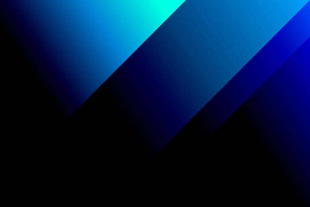
Gradient Angle and Direction

When it comes to creating unique and interesting gradients, adjusting the angle and direction of the gradient can make all the difference. In CSS, you can control the angle and direction of a gradient using the “angle” property.
The “angle” property is measured in degrees, and it determines the direction of the gradient. For example, an angle of 0deg would create a vertical gradient that moves from top to bottom. An angle of 90deg would create a horizontal gradient that moves from left to right.
But what if you want your gradient to move in a diagonal direction? No problem! You can adjust the angle property to achieve the desired effect. For example, an angle of 45deg would move the gradient from the bottom left corner to the top right corner.
In addition to controlling the direction of the gradient, you can also adjust the shape of the gradient using the “background-size” property. This property controls the size of the gradient, and it can be set to “cover” to ensure that the gradient fills the entire background.
Another way to create interesting gradient effects is to use multiple gradients. With multiple gradients, you can layer different gradients on top of each other to create a more complex and dynamic effect.
Overall, adjusting the angle and direction of your gradients can be a great way to add depth and visual interest to your designs. Don’t be afraid to experiment with different angles and shapes to create a unique and eye-catching look.
Another way to create interesting gradient effects is to use multiple gradients.
Using Gradients in Backgrounds

Gradients can be a versatile tool when designing backgrounds for websites. They can add depth and texture to an otherwise flat design, and can provide a great way to transition from one color to another.
One way to use gradients in backgrounds is to create a subtle gradient that fades from one color to another. This can be achieved by using a linear gradient with a 90-degree angle. By default, the gradient will transition from the top of the element to the bottom. However, you can adjust the angle to achieve a diagonal gradient.
Another way to use gradients in backgrounds is to create a more complex effect by using multiple gradients. This can be done by using the background-image property to add multiple gradients to an element. Each gradient can have its own set of color stops and direction, allowing for a more intricate design.
It’s important to note that when using gradients in backgrounds, you should consider the overall look and feel of the website. Gradients can be a great way to add interest, but they can also be distracting if overused. It’s important to strike a balance between functionality and design.
When using gradients in backgrounds, it’s also important to consider accessibility. If the gradient makes text difficult to read, it may need to be adjusted or removed altogether.
In summary, using gradients in backgrounds can be a great way to add interest and depth to a website’s design. By experimenting with different types of gradients and color stops, you can create unique and eye-catching designs. However, it’s important to consider the overall design of the website and to ensure that the gradients do not negatively impact accessibility.
They can add depth and texture to an otherwise flat design, and can provide a great way to transition from one color to another.
Conclusion: Adding Gradients to Your Web Design
Congratulations! You have now learned all about CSS gradients and how to use them in your web design projects. By following the step-by-step instructions in sections three and four, you should now be able to create simple and complex gradients with ease and add color stops to create more interesting effects.
In section five, we discussed how to adjust the angle and direction of gradients to achieve the desired effects. It’s essential to experiment with different angles and directions to find the perfect gradient for your design.
In section six, we provided examples and tips on how to use gradients in backgrounds to create eye-catching designs. Remember to consider the color theory and the message you want to convey when using gradients in your backgrounds.
CSS gradients are an excellent tool for web designers to create visually appealing designs. They add depth, dimension, and interest to your website, making it more engaging for users. By using gradients, you can create a unique look and feel for your website.
In conclusion, we encourage you to experiment with CSS gradients in your web design projects. Don’t be afraid to try out new combinations and effects. Remember, the possibilities are endless! By using gradients, you can take your website design to the next level and make it stand out from the crowd.