Welcome to our blog post on CSS animations! In today’s digital world, animations play a vital role in enhancing the user experience on websites and applications. Whether it’s a subtle hover effect or a fancy transition between slides, understanding the basics of CSS animations can take your web design skills to another level.
In this blog post, we will guide you through the ins and outs of CSS animations, providing you with a comprehensive understanding of how they work and how to create stunning animations that captivate your audience. We’ll cover everything from the fundamental concepts to advanced techniques, so even if you’re a beginner, don’t worry! We’ve got you covered.
By the end of this post, you’ll be equipped with the knowledge and skills necessary to harness the power of CSS animations in your web projects. So, let’s dive in and explore the world of CSS animations together!
CSS animations allow you to bring static elements to life, adding movement and visual interest to your web pages. By using a combination of CSS properties and values, you can create animations that are smooth, fluid, and visually appealing.
However, CSS animations can be a bit overwhelming at first, especially if you’re new to web development. That’s why we’re here to break it down for you, step by step. We’ll start by explaining the basics of CSS animations, including how they differ from CSS transitions and how to apply them to your elements.
Once you have a solid understanding of the basics, we’ll move on to choosing the right animation properties and values. This section is crucial as it will help you decide which properties and values best suit the type of animation you want to achieve. We’ll discuss the different animation properties available and explore their various options and values.
Creating smooth and fluid animations is the next topic on our agenda. We’ll show you some useful tips and tricks to ensure your animations are seamless and visually pleasing. From easing functions to timing functions, we’ll cover the essential techniques that will make your animations stand out.
But we won’t stop there! We’ll also delve into using keyframes for advanced animations. Keyframes allow you to define specific animation points and customize the animation’s behavior at each step. We’ll guide you through the process of creating keyframe animations and demonstrate how you can achieve complex and dynamic effects using this powerful technique.
Adding interactivity to your animations is another exciting aspect we’ll explore. CSS animation events enable you to trigger animations based on user interactions or specific conditions. We’ll show you how to use these events to create interactive animations that engage and delight your users.
Finally, we’ll wrap up with a conclusion that summarizes the key points covered in this blog post. We’ll also encourage you to continue experimenting and exploring the vast possibilities of CSS animations. Remember, practice makes perfect, and the more you experiment, the more confident you’ll become in creating captivating animations.
So, whether you’re a beginner looking to learn the basics or an experienced web developer seeking to level up your animation skills, this blog post is for you. Get ready to embark on an exciting journey into the world of CSS animations. Let’s get started!
Understanding the basics of CSS animations

In the ever-evolving web development landscape, CSS animations have emerged as a powerful tool for bringing websites to life. By combining CSS properties and values, developers can create visually stunning and engaging animations that captivate users. In this second part of our blog series, we will dive deep into understanding the basics of CSS animations and how they can be utilized to enhance the user experience.
CSS animations allow elements to move, change shape, and transition smoothly from one state to another. They can be applied to various CSS properties like opacity, position, size, color, and many more. Understanding the fundamental concepts behind CSS animations is essential to unleash their full potential.
One key concept to grasp is the concept of keyframes. Keyframes define the intermediate steps of an animation, specifying the properties and values at different points in time. These steps, or keyframes, are then interpolated by the browser to create a smooth animation. By specifying multiple keyframes, developers have precise control over the animation’s appearance and behavior.
Another crucial aspect of CSS animations is the timing function. The timing function determines how an animation progresses over time, defining the acceleration or deceleration of the animation. There are various timing functions available, such as linear, ease-in, ease-out, ease-in-out, and more. Choosing the right timing function can significantly impact the overall feel and flow of the animation.
When working with CSS animations, it’s important to consider browser compatibility. While CSS animations are widely supported across modern browsers, it’s always a good practice to test and ensure compatibility with older versions as well. Additionally, performance should also be taken into account, as poorly optimized animations can lead to sluggishness and negatively impact the user experience.
Lastly, it’s worth noting that CSS animations can be combined with other CSS features, such as transitions and transforms, to create even more dynamic and engaging effects. By leveraging these techniques together, developers can achieve a seamless and immersive user experience that keeps visitors hooked.
Now that we have a solid understanding of the basics of CSS animations, we can move on to the next part of our blog series, where we will explore the process of choosing the right animation properties and values. Stay tuned for more insightful tips and tricks on creating stunning animations with CSS!
The timing function determines how an animation progresses over time, defining the acceleration or deceleration of the animation.
Choosing the right animation properties and values

When it comes to CSS animations, choosing the right animation properties and values can make a significant difference in the overall look and feel of your website. In this section, we will delve into the various options available and provide you with insights on how to make informed decisions.
One of the most fundamental animation properties is animation-duration. This property allows you to specify the duration of an animation in seconds or milliseconds. It determines how long it takes for the animation to complete a full cycle. For example, setting the duration to 2 seconds will make the animation last for 2 seconds before starting again.
Another crucial property to consider is animation-timing-function. This property controls the pace and timing of the animation. There are several predefined values available such as ease, linear, ease-in, ease-out, and ease-in-out. Each value affects the animation’s acceleration and deceleration, giving you the flexibility to achieve the desired visual effect.
In addition to duration and timing function, animation-delay can be used to introduce a delay before the animation begins. This can be useful when you want to stagger the animations of multiple elements or create a more dynamic and engaging user experience.
For more intricate animations, the animation-iteration-count property comes into play. By default, animations play only once, but you can specify a number to make them repeat a certain number of times or use the value infinite to create an animation that continues indefinitely. This property allows you to strike a balance between visual appeal and performance.
When it comes to animating specific properties, animation-name is your go-to property. It references a keyframe animation defined using the @keyframes rule, which we will cover in more detail later. This property enables you to apply complex animations to specific elements on your website.
It is worth noting that not all CSS properties are animatable. While many properties like color, background-color, opacity, and transform can be animated, others like display and margin cannot. Understanding the limitations of animatable properties will help you avoid frustration and ensure smooth and fluid animations.
Lastly, be sure to experiment and play around with different values and combinations of properties to find the perfect animation for your website. Don’t be afraid to adapt and refine your choices as you go along, as CSS animations offer a great deal of flexibility and customization options. Remember, the goal is to create an engaging and enjoyable user experience that aligns with your brand and content.
In the next section, we will explore techniques for creating smooth and fluid animations that captivate your visitors. Stay tuned!
When it comes to animating specific properties,
animation-nameis your go-to property.
Creating smooth and fluid animations

When it comes to CSS animations, creating smooth and fluid animations is essential to provide an engaging user experience. In this section, we will explore some techniques and best practices to achieve this.
1. Optimize your animations
One of the key factors in creating smooth animations is optimizing their performance. Animations that require a high amount of CPU or GPU resources can lead to janky or stuttering animations.
To optimize your animations, you can:
- Minimize the number of animated elements on the page
- Avoid animating properties that trigger layout recalculations, such as width or height
- Use the
will-changeproperty to let the browser know which elements will be animated, allowing it to optimize the rendering process - Consider using CSS hardware acceleration with properties like
transformoropacityto offload some of the animation processing to the GPU
2. Implement easing functions
Easing functions define the rate of change of an animation over time, allowing you to create animations that accelerate, decelerate, or follow custom patterns. By default, CSS animations have a linear easing function, which creates a constant speed animation.
However, you can enhance the feel of your animations by applying different easing functions. CSS provides several predefined easing functions such as ease-in, ease-out, and ease-in-out. You can also create your custom easing functions using the cubic-bezier function.
3. Control animation timing
Controlling the timing of your animations is crucial to achieving smoothness. By default, animations begin immediately and run for their specified duration. However, you can use the animation-delay property to introduce a delay before an animation starts.
Additionally, you can control the duration of an animation using the animation-duration property. Longer durations can make animations appear smoother, but be mindful not to make them too long as it may affect the overall user experience.
4. Use easing and timing functions together
To create more complex animations, you can combine easing functions with timing functions. The animation-timing-function property allows you to specify a function that describes how the animation progresses over time.
By experimenting with different easing and timing functions, you can add personality and dynamism to your animations. For example, using a steps() timing function can create a frame-by-frame animation effect, simulating a stop-motion look.
5. Test and iterate
Creating smooth and fluid animations often requires iterative testing and tweaking. Use your browser’s developer tools to inspect and analyze the performance of your animations. Look out for dropped frames or excessive resource consumption, as these can indicate areas for improvement.
Consider testing your animations on different devices and browsers to ensure a consistent experience across platforms. User feedback can also be invaluable in identifying areas where animations can be optimized.
Remember, creating smooth and fluid animations is an ongoing process. Don’t be afraid to experiment, learn from others, and iterate on your designs to continuously improve the user experience.
By default, animations begin immediately and run for their specified duration.
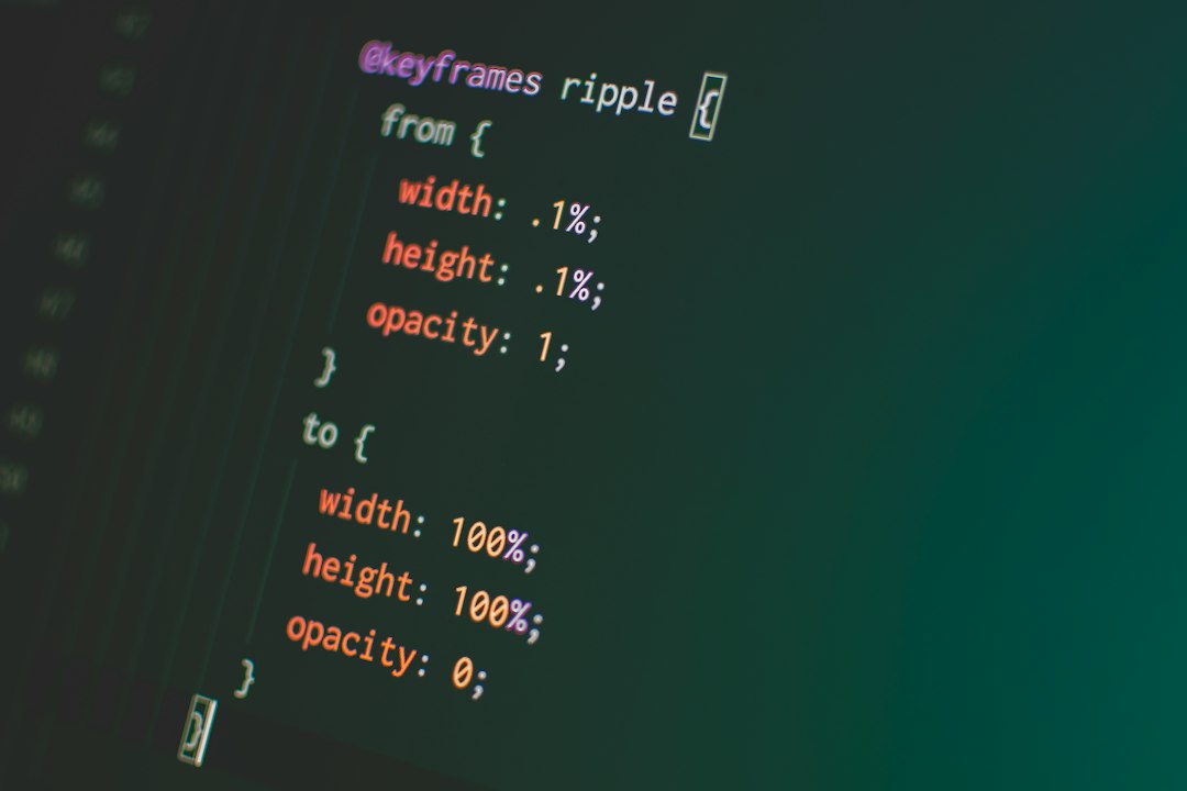
Using keyframes for advanced animations

Now that we have covered the basics of CSS animations and explored various properties and values, it’s time to take our animations to the next level. Keyframes are an essential tool in creating advanced animations that are dynamic and visually appealing.
Keyframes allow you to define specific points in an animation where you can control the style properties. This gives you the flexibility to create complex animations with multiple stages and transitions. By specifying keyframes at different percentages, you can define how the animation should look at each step of its progress.
Let’s say you want to create an animation where an element gradually fades in, rotates, and then moves across the screen. With keyframes, you can easily achieve this effect by defining the animation’s behavior at specific intervals. For example, you can set the element’s opacity to 0% at the beginning, increase it to 100% halfway through, and then rotate and move it to its final position.
Keyframes are defined using the @keyframes rule in CSS. You specify a name for the animation and then define the styles for each keyframe. Each keyframe is represented by a percentage value, ranging from 0% to 100%, indicating the progress of the animation. You can define as many keyframes as you need to create the desired effect.
For example, let’s create a keyframe animation called fade-in-rotate that gradually fades in an element and rotates it:
“`css
@keyframes fade-in-rotate {
0% {
opacity: 0;
transform: rotate(0deg);
}
50% {
opacity: 1;
transform: rotate(180deg);
}
100% {
opacity: 1;
transform: rotate(360deg);
}
}
“`
In this example, at 0% progress, the element is initially invisible with an opacity of 0. It is also rotated by 0 degrees. At 50% progress, the opacity is set to 1, making the element fully visible, and it is rotated by 180 degrees. Finally, at 100% progress, the rotation completes with a full 360 degrees.
Once you have defined the keyframes, you can apply the animation to an element using the animation property. You specify the name of the animation, the duration, and any other desired options. For example:
“`css
.element {
animation: fade-in-rotate 2s infinite;
}
“`
In this case, the animation will last for 2 seconds, and it will repeat indefinitely. You can also specify easing functions to control the animation’s acceleration and deceleration, as well as delays and iteration counts.
Using keyframes, you can unleash your creativity and bring your animations to life. By combining different styles and transitions at specific intervals, you can create mesmerizing effects that captivate your audience. Don’t be afraid to experiment and tweak your keyframes until you achieve the desired result.
Remember, practice makes perfect, and it may take some trial and error to master the art of using keyframes effectively. But once you do, you’ll be able to create animations that add a touch of magic and interactivity to your web projects.
Adding Interactivity with CSS Animation Events

When it comes to CSS animations, interactivity can take your designs to a whole new level. By leveraging CSS animation events, you can create dynamic and engaging experiences for your users. These events allow you to trigger actions or execute code at specific points during an animation, opening up a world of possibilities.
One popular CSS animation event is the animationstart event, which is fired when an animation begins. This event can be useful for initializing variables or performing setup tasks before the animation starts. For example, you can use it to set the initial state of an element or to prepare the environment for a complex animation sequence.
Another commonly used event is the animationend event, which is triggered when an animation completes. This event is perfect for executing actions that need to happen once the animation is finished. You can use it to trigger other animations, update the DOM, or even navigate to a different page. The possibilities are endless!
In addition to these two events, there are a few more animation events that you might find helpful. The animationiteration event is fired every time an animation completes a cycle. This can be useful if you want to create a looped animation effect or if you need to update the DOM periodically during an animation.
Furthermore, the animationpause and animationresume events can be used to pause and resume an animation. These events can be handy if you want to give users control over the animation playback or if you need to synchronize animations with other user interactions.
To add interactivity to your CSS animations, you simply need to attach event listeners to the desired elements. You can do this with JavaScript or directly in your CSS using the @keyframes rule. When an animation event is triggered, the associated event handler will be executed, allowing you to perform any actions you need.
Keep in mind that not all browsers support CSS animation events, so it’s essential to test your animations across different platforms. Additionally, make sure to provide fallbacks or alternative experiences for users who may not have access to the full interactivity.
CSS animation events provide a powerful way to add interactivity to your animations. By leveraging these events, you can create dynamic and engaging experiences for your users. Whether you want to trigger actions at specific points during an animation or allow users to control the playback, CSS animation events offer a wide range of possibilities. So go ahead and explore this exciting feature to take your CSS animations to the next level!
You can do this with JavaScript or directly in your CSS using the
@keyframesrule.
Conclusion
In conclusion, CSS animations have become an essential part of modern web design, allowing developers to bring websites to life with engaging and interactive elements. Understanding the basics of CSS animations is crucial for creating visually appealing and user-friendly websites.
During this blog post, we have explored the fundamentals of CSS animations, starting from the basics and gradually delving into more advanced techniques. We discussed how to choose the right animation properties and values to achieve the desired effects, ensuring smooth and fluid animations.
We also explored the power of keyframes, enabling us to create complex and intricate animations that animate specific properties along a timeline. Keyframes provide developers with endless possibilities for creating unique and eye-catching animations that captivate users’ attention.
Additionally, we saw how CSS animation events can add interactivity to our animations, allowing us to trigger actions based on certain animation states. This opens up a whole new world of possibilities for creating dynamic and engaging user experiences.
It is important to remember that while CSS animations offer a wide range of possibilities, it is crucial to use them judiciously. Animations should enhance the user experience, not distract or overwhelm users. They should be used to guide users’ attention, provide feedback, or create a sense of delight.
Furthermore, it is vital to optimize animations for performance, ensuring that they do not slow down the website or consume excessive resources. Modern browsers offer various tools and techniques to assist in this process, such as hardware acceleration and animation throttling.
As technology continues to evolve, so do CSS animations. New properties, values, and techniques are constantly being introduced, allowing developers to push the boundaries of what is possible. It is crucial for developers to stay up-to-date with the latest trends and advancements in CSS animations to create cutting-edge websites.
In conclusion, CSS animations offer a powerful and flexible toolset for adding life and interactivity to websites. With a solid understanding of the basics, the right animation properties, and a touch of creativity, developers can create visually stunning and engaging animations that leave a lasting impression on users. So go ahead, experiment, and bring your websites to life with CSS animations!